Korean Air 2025 Rebrand Review
Arya Yudhistira
3/26/20252 min read
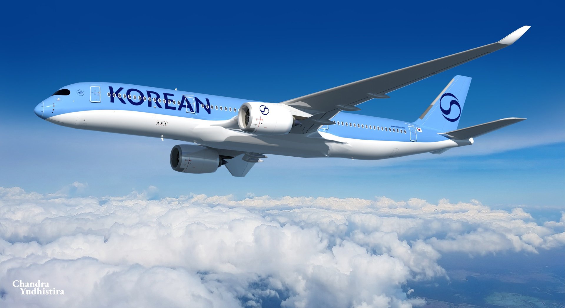
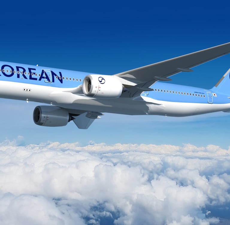
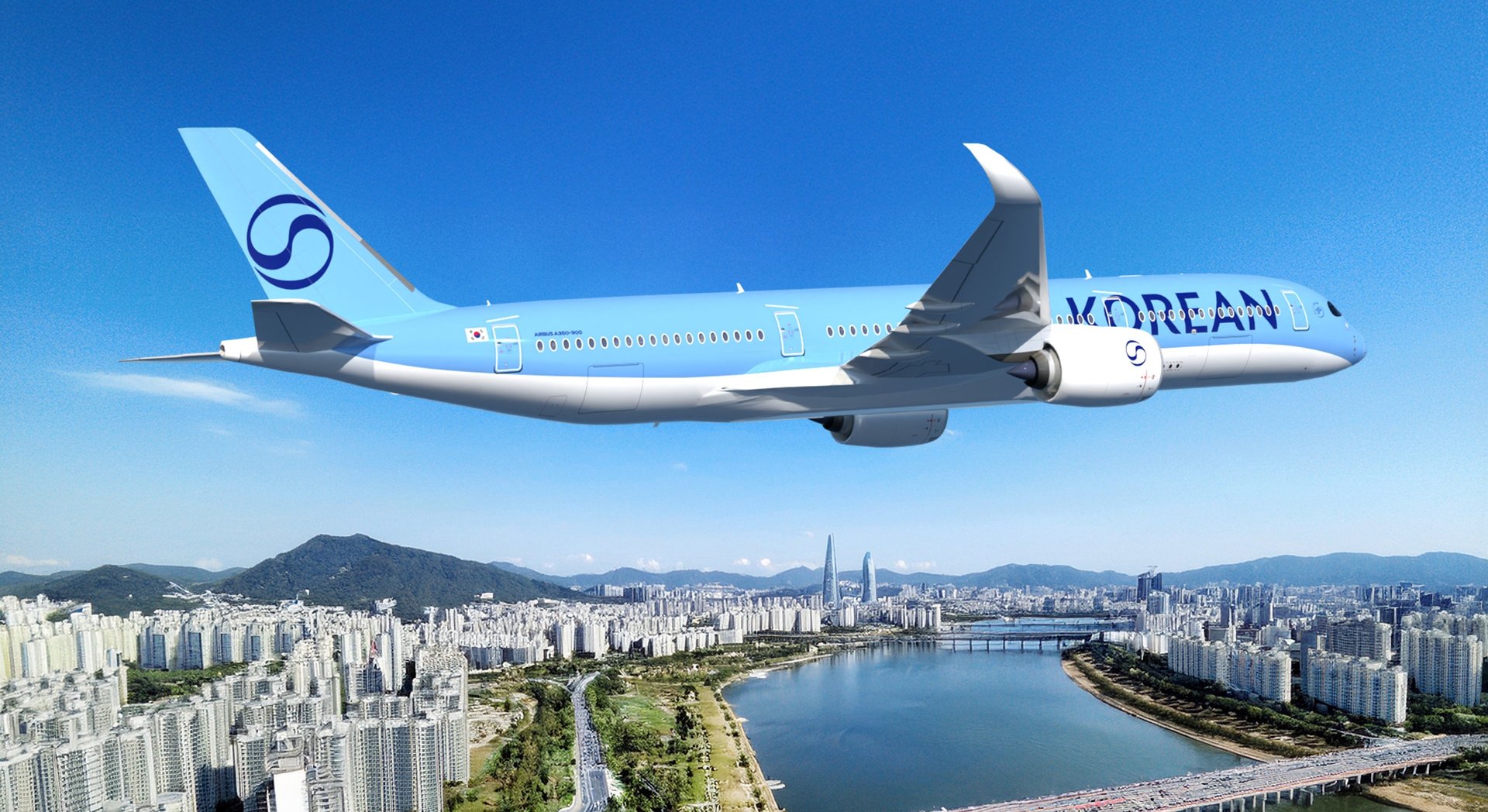
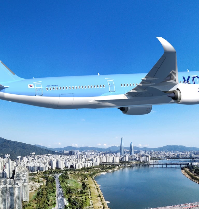
South Korea's flag carrier, Korean Air, revealed its newest rebrand in early March 2025. This rebranding results in public shock as it completely rejuvenates the iconic scheme that has been flying for well over 40 years. The livery rebrand completely remove the iconic gray stripe and infamous "Pepsi" red-white Korean Taeguk, switching it into a more minimalistic design. The current livery leaving only two shades of blue.
The rebrand was initiated by Lippincott, a company that completely renovated the look of Korean Air. According to Lippincott, " the refreshed design extends seamlessly across physical and digital touchpoints," implying a harmonization between media to promote "high-end hospitality."
Internet flamed with this redesign, emphasizing the bold transformation to oversimplification and a brutally minimalist approach. In the public's opinion, the result of this phenomenon is a dullness upon airline liveries. The public deemed redesigns such as this to be "boring" and "too lazy of a work". Similar cases happened to airliner branding could be found on Lufthansa (2018), Aer Lingus (2019), or Aegean (2020). Though some criticized this move, many favor the process of modernization as an adaptive move to follow the current design trend.
To the public, the rebrand process might seem lazy and boring. One must consider that this is not a result of just a livery branding. It is a process to integrate an entire branding system, from banner, ticketing, trucks, and website, all the way to cutlery and amenities. The livery must integrate and correspond to the entire Korean Air system. A livery stands out as one of the largest appealing media to be displayed to the public visually. It must be considered that the fast majority of people only caught the entire Korean Air branding from just the livery as it is the only chance for a branding to be displayed amongst people.
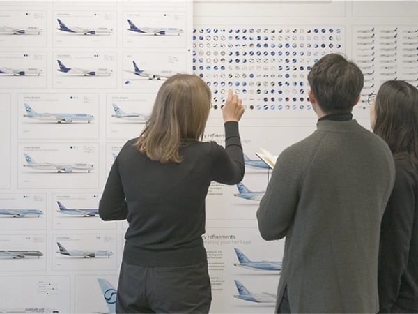
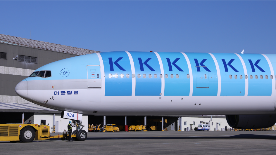
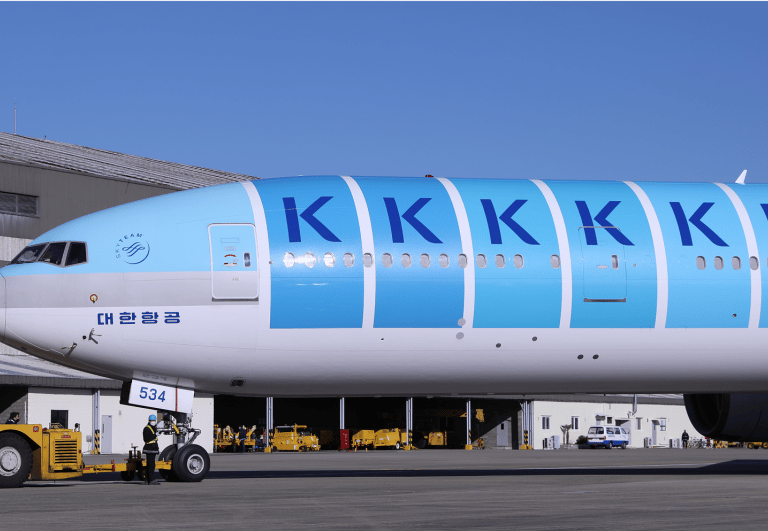
Lippincott, the company behind this rebrand, also went through numerous brand developments, looking by their teaser video and images on their website. I suppose this is also the most I've seen an airline expose their R&D process in terms of scheme and logo testing. They probably went through dozens- even perhaps hundreds- of schemes, with some looking like straight duplicates of KLM, Aegean, and to bizarre ones as well. They implemented a bunch of experimental "K" decals to the front side of a Boeing 777 to decide the best placement of the airline's title.
Since, of course, a successful branding pivots on how successful a message impacts the correct target market. Korean serves as a flag carrier whose prioritize luxury and professionalism as its outmost important goal. To adapt to the newest trends and values, the branding was initiated by carefully determining target customers, a broad and international community through the lens of Korean aesthetics.